Saturday, April 29, 2017

Fear And Greed Index As At April 28, 2017

The Index is sitting on 50 as at the close on April 28, its neutral position.
This past week it has moved from a slight position of Fear to the Neutral position.

DaveM-0069

This following chart shows movement of the indicator over a period of years


DaveM-0071


These charts are courtesy of CNNMoney, you can see the compinents of the Index by clicking here

Fear and Greed Index As At April 27, 2017

Again today we have the indicator in a neutral territory, moving, perehaps a little further to the Greed section.
The markets are showing a steady advance.


DaveM-0061

This following chart shows the movement of the indicator over several years.


DaveM-0062

Bottom Dwellers About To Move North As At April 27. 2017


These Instruments appear poised to move higher in coming days

image


Please note that these scans are not suitable for trading advice. Each of these scans is in a development phase, they are being refined as each day passes.
Watchlists are being studied and refinements made, until there is some good degree of reliability, these scans are unsuitable except to record the scans.

Bottom Dwellers About To Move North As At April 28. 2017

Today there is just one item in the scan.


image


Please note that these scans are not suitable for trading advice. Each of these scans is in a development phase, they are being refined as each day passes.
Watchlists are being studied and refinements made, until there is some good degree of reliability, these scans are unsuitable except to record the scans.

Volume Movers From April 28, 2017


Up on Big Volume

DaveM-0076


Down on Big Volume

DaveM-0077


Please note that these scans are not suitable for trading advice. Each of these scans is in a development phase, they are being refined as each day passes.
Watchlists are being studied and refinements made, until there is some good degree of reliability, these scans are unsuitable except to record the scans.

Will Tax Cuts in The United States Lead to Disaster?


The United States President has a whim that he wants to dramatically cut taxes. That was one of his election promises.

Of course businesses want tax cuts, and so do the tax paying public.

That may well lead to problems, big problems.

The United States has phenomenal debt, there is no end in sight for the debt with the current tax structure and a dramatic tax reduction will mean accelerating the growth of the debt.

Politicians are great for dreaming up ways to get votes, it is their great skill.

There is not a lot of evidence that massive tax cuts will enhance an economy. Many nations have tried it and failed.

It may well be that Trump is going to cause a huge problem with his tax cuts and, of course, the Republicans will be afraid to speak against him.

To make this brief…… The United States is headed for the crash of the ages, many people have recognized this already and are afraid to speak up.

Check out this video, it is 20 minutes long and jam packed with valid thinking.

https://www.youtube.com/watch?v=HVqteGX9UqU

Enjoy!!

Friday, April 28, 2017

Oil Price Seems To be Building A Base

Oil has been trading in a range for a few days, actually a couple weeks. Price has drifted down steadily since April 12.
There are a few resons for that, one of them being increased US production.
Another reason is the oversupply.
And a third reason for soft prices is uncertainty as to whether OPEC will agree to extend their quotas.
If there is not an extension of the quota, Russia has new fields to bring into production and other nations will be wanting to increase as well.


DaveM-0066


This chart is clearly showing that there is no direction, just indecision.

However, that is the current market, this week.

What looks good in future is that new reserves are not being discovered as in past years. Exploration is down and many wells are old and close to being finished.

Worldwide demand is poised to increase as economies recover.

Here is a Point and Figure Chart

DaveM-0060


As you can see on this chart, price has been in a range for a long time. Oil is building a strong base and we will see quite a move as time passes.
We do not know when the rise will begin but looking at the base being built we can know there will be a significant rise in future.


DaveM-0067


This chart, a monthly chart, has a bullish Fibonacci Pattern, indicating a rise in future.

This last chart is an Elliot Wave chart from earlier in the month. You can see that the chartist expects a rise in future. I am sorry that I can not provide a more recent chart, I will be watching to see if one is produced as days pass.
(Chart courtesy of Forex Crunch)

Current world events such as the Korea US negotiations could easily provide an impetus for price rise.


Wednesday, April 26, 2017

Fear and Greed Index As At April 26, 2017

The chart reading has barely moved since yesterday, we are still a tiny bit towards Fear, really a neutral position.


image


Here is the chart showing recent values.


image


The Fear and Greed Index is provided as a service by CNN Money

Volume Movers From April 26, 2017


Up On Big Volume


image  


Down On Big Volume 


image


These lists are comprised of stocks whose volume is more than 200,000 and is more than 200 percent of the 30 day average volume and the close differs by 10 percent or more from the prior day close.


Please note that these scans are not suitable for trading advice. Each of these scans is in a development phase, they are being refined as each day passes.

Watchlists are being studied and refinements made, until there is some good degree of reliability, these scans are unsuitable except to record the scans.

Bottom Dwellers About To Move North As At April 26, 2017


This list results from a scan looking for stocks that have been drifting and are about to turn higher.

I did this scan many times on prior days to see what develops once they make this list..

Below are some charts from today's list, you will see that they all have started to move higher.


Please note that these scans are not suitable for trading advice. Each of these scans is in a development phase, they are being refined as each day passes.
Watchlists are being studied and refinements made, until there is some good degree of reliability, these scans are unsuitable except to record the scans.


Bottom Dwellers About To Move North as at April 25, 2017


This scan reveals stocks that are showing signs of moving higher in the nest couple sessions.

Perhaps a good idea to make a note of these and observe them, there may be an opportunity here.


image


Update April 28, 2017


I took the prices above and made a comparison to the close on Friday, April 28. 

You can see that there has not been great appreciation in price.

However, for most of these, there was a gain on the day after they were first posted.

In coming days I will be attempting to refine the scan to get a longer term gain.


Please note that these scans are not suitable for trading advice. Each of these scans is in a development phase, they are being refined as each day passes.
Watchlists are being studied and refinements made, until there is some good degree of reliability, these scans are unsuitable except to record the scans.

Volume Movers From April 25, 2017


UP ON BIG VOLUME

image

DOWN ON BIG VOLUME

image


Please note that these scans are not suitable for trading advice. Each of these scans is in a development phase, they are being refined as each day passes.
Watchlists are being studied and refinements made, until there is some good degree of reliability, these scans are unsuitable except to record the scans.

Tuesday, April 25, 2017

Light Sweet Crude Oil as At April 25, 2016

Oil price has been a bit soft for a while and many people are concerned that the price is South of $50.00

However, they are going to feel relieved in the next few days as oil recovers and moves higher.

I have three charts here, each with a bullish Fibonacci Pattern, a strong indication that price recovery is near.

Analysts are hopeful that US Oil stocks may have fallen by 1,600,000 barrles this past week that should fuel a rise in price once the numbers are confirmed.


DaveM-0049


DaveM-0050


DaveM-0051

Fear and Greed Index As At April 25, 2017

We are moving away from Fear and towards Greed.
The Fear and Greed Index has moved to neutral ground, just below 50 at the close today.

DaveM-0047


Here is the chart showing recent values.


DaveM-0048


The Fear and Greed Index is provided as a service by CNN Money

Experiencing the Death Cross today April 25, 2017


These stocks had their 50 sma cross below their 200 ma by noon EST today


DaveM-0046


MRO - U S X-MARATHON GROUP INC
RTTR - Ritter Pharmaceuticals Inc
MTDR - MATADOR RESOURCES COMPANY


CLNS - Colony NorthStar Inc

PES - Pioneer Drilling Co

GWR - Genesee & Wyoming Industries

CRS - CARPENTER TECH CORP

DBO - PowerShares DB Oil Fund

DGLD - VelocitySharesTM 3x Inverse Gold

PNAT - PURA NATURALS INC

PLOW - Douglas Dynamics Inc

USL - United States 12 Month Oil Fund LP

CAPL - Lehigh Gas Partners

ZMLP - Direxion Zacks MLP High Income Shares

PWOD - Penns Woods Bancorp, Inc.


What’s Up With The Price Of Gold?

Here is a quick look at different charts to get an idea of support and resistance levels.


It may be that we are waiting for the United States President to have another tantrum before Gold will move far.


Trump is so desperately looking for a ‘win’ in his first 100 days as President that he may do something exciting this week – who knows?

These charts are pretty self-explanatory.


Which Way For Oil?

Oil Price is sitting just under $50.00 this morning and it has been there for a few days.


DaveM-0039


It seems that China is temporarily easing off imports although the domestic production is gradually decreasing.

The OPEC group has not made a decision as of yet to extend their production quotas.

Russia is ready to bring on new production if OPEC decides to eliminate their quotas.

Thus the speculators are going to have to wait for news before jumping into oil again in a big way.


Good Trading..!

Monday, April 24, 2017

Fear and Greed Index as at April 24, 2017

Today’s Fear and Greed Index as provided by CNN Money


DaveM-0037


The Fear and Greed Index is a composite developed by the staff at CNN Money and reflects their application of several market technical indicators.

Following is a chart showing the index over time.

DaveM-0038

The ‘Magic Ribbon’ Trading Strategy and Google Alphabet Stock

How does the Magic Bands Strategy work with Google Alphabet?


This morning the Magic Bands strategy shows an excellent pop for Google Alphabet stock. It seems that right off the open in New York, Alphabet was going to shoot up.

DaveM-0036


As the most popular of all of the search engines, Google has a tremendous potential for revenue and that just seems to grow and grow.
The Alphabet stock is up close to 10 percent for the year and seems ready to advance further.
Recently the company and PayPal concluded an agreement to let people use their Android phones for store purchases.

The Magic Bands trading strategy is a very simple visual strategy, clearly indicating long and short moves. When the light blue is showing the market is movi8ng higher and when the red is showing we see the market moving lower.
Alphabet has a few trend changes daily on a 5-minute chart, the Magic Bands shows these moves clearly making it very easy to trade this market.
Simply constructed, the system uses 2 sets of Bollinger Bands and the ‘Ribbon’ Indicator.
Bollinger Bands settings are 15 0.05  and 50 0.05.
The ribbon indicator for Metatrader is available with a internet search.

Do you have any suggestions or questions about this strategy? Be sure to use the comment form and let’s discuss it.

Good Trading…!

Sunday, April 23, 2017

Modification of the Larry Connors RSI(2) Strategy

Larry Connors developed for daily charts his RSI(2) strategy, I wanted to modify it as an experiment.
Developing an EA and a portfolio of Ea’s is constant experimenting, adjusting, testing and finally real time trading.
His original specification was the RSI(2) being below 5, I changed that to 10.
One specification is that price ios to be above the 200 moving average, I retained that.
I also inserted a stop loss and a take profit as well asd using a channel for exit.
Actually the generator inserted the LSMA Channel after several hours of generating.
I chose to use the EURUSD pair and the time frame is 4 hours.
That covers the modifications.

Let’s have a look at the results.

Here is the equity curve.

DaveM-0030


You can see that there is a period of stagnation that lasts for quite a long period. Of course, the specification that price has to be above the 200 ma can result in gaps, so the stagnation can be expected.

Here is some statistics


DaveM-0031


These statistics are not really impressive to me.
The System Quality Number is great at 4.40, the Equity Drawdown is also great at 0.17. Those are the good points.
Profit Factor is only 1.56, I would prefer well over 2 for this metric.
Stagnation at 686 is far more than I would like because ut is taking so long to recover from losses.
Maximum consecutive losses at 12 is not what I prefer. That means there are many losses in groups of 3 or 6 or 10 which eat the capital and take time to recover from.
Win Loss ratio at 0.32 is not satisfactory.

Here are some additional statistices. In this chart is shown the reason that I will not use this approach for trading.

DaveM-0032


You will notice in the trade distribution that the long entrieshad almost twice as many losers as winners………just the opposite for the short trades….
For that reason I will not use this strategy as I prefer there to be a relative balance.

I have been wanting to experiment with this RSI(2) system for quite a while because many people have written about it in their blogs. For me, it was quite disappointing.

However, in system research we have to try many things, try to learn and use experience for developing systems that work reliably. Some days we succeed although those days are scarce… (humor).

Tomorrow I will have another experiment.

Good Trading….

Saturday, April 22, 2017

Fear and Greed, The Market Indicator created by CNN


There are all sorts of market timing indicators available, nor one of them will give constant success, The Fear and Greed Indicator is one of many that a trader can use to get a sense of the market.

The representation of the indicator is a meter, similar to a car speedometer.
Here is what it looks like on the web page.


DaveM-0028


That is the indicator showing results for the close on Friday, April 21, 2017.
As you can see from looking at it, it fluctuates from Extreme Greed to Extreme Fear. Traders can know that when the indicator is showing a great degree of fear, it is time to start to look for long trades, conversely, when the greed is extreme, it is time to lighten up and look for shorts.
That meter approach makes it very easy to get a sense of the markets and is one more tool in the trades tool kit for assessing the markets.
The neutral position at 50 gives the trader something to think about…. as the market is between fear and greed and maybe will make a strong move one way or the other. Sometimes it is best to stand aside.

From Warren Buffet - “Be fearful when others are greedy, be greedy when others are fearful”.“

The composition of the Fear and Greed Index.


CNN has done a lot of work to put this indicator together, a lot of research and testing.
Instead of having to look at several indicators and combine the results a trader needs only to look at this one and see what the combination of 7 indicators gives, saving a lot of time.
The components are as follows:
Market Momentum which compares the S&P 500 to is 125-day average.
Junk Bond Demand which compares the Yield Spread between Junk Bonds and Investment Grade Bonds
Market Volatility which uses the CBOE Volatility Index and the 50-day average.
Stock Price Strength which compares Net New 52 Week Highs and Lows on the NYSE
Stock Price Breadth which uses the McClellan Volume Summation Index considering advancing and declining volumes on the NYSE
Put and Call Options using the CBOE 5 day Average Put/Call Ratio
Safe Haven Demand using the Difference in 20-day stock and bond returns

Once you have looked at the composition of the Fear and Greed Index you can see how much faster it is to research this page instead of compiling all of the data separately.

Here is a chart reflecting the index over a few years (from CNN)


DaveM-0029


I am not so sure that a trader can base decisions solely on this index, but the index certainly has something to offer in terms of reference as to the mood of investors. 

I am aware that some people have attempted to use the index in trading algorithms, however, there is not a lot of data available for this purpose. 

For my purpose, the Fear and Greed Index is something to have a look at when performing due diligence.

For further information, you can have a look at the CNN 
page here.

Quote of the Day - April 22, 2017


“Throughout my financial career, I have continually witnessed examples of other people that I have known being ruined by a failure to respect risk. If you don’t take a hard look at risk, it will take you.” – Larry Hite

Larry Hite is one of the first developers of system trading and a successful hedge fund manager.

Wednesday, April 19, 2017

Is Twenty Five (25) Percent Drawdown Acceptable For Your Trading Strategy?

What is the acceptable limit for your strategy? – 15% drawdown, 40% drawdown


Drawdown is a most important item for any trading strategy and should be incorporated into the Trading Plan from the outset.
Limits have to be considered and rules have to be applied before serious consequences appear in live trading.
Drawdown affects a couple items in the trading plan.
The first is the stop loss to be applied to each trade. It does not matter if the trade will show a huge profit if there is a substantial equity drawdown that takes months to resolve.
A long lasting equity drawdown will keep the trader out of the market and thus tie up the trading capital when other trades could be made for profit.
A serious loss on a closed trade can impair the ability to place more trades.
We, therefore, have to be cognizant of drawdown and ensure that we are always operating within acceptable limits.


Investopedia has an excellent description of drawdown here


Applying Stop Loss is essential to prevent excessive drawdown.


For a manual system, the trader is going to have to simulate trading over a long period, perhaps 500 entries, keep statistics as to MAE, profits, losses, stop placement etc so as to determine what is going to be acceptable for that system.
Many people fail at doing this as it takes many hours and one has to persist in order to get the statistics needed. However, Once a person does this task, they will have a very accurate idea as to their system and its potential and rules.

For an automated system, the developer can preset the drawdown and limit it before starting the backtesting and optimization…. My settings are 15 % maximum and I hope to see smaller on individual strategies.
There is a problem with consecutive losses in any system, there is often instances where the stop loss gets hit in a sequence of 7 or 15 times or perhaps even more. We have to evaluate those systems closely to see if we really want that.

Some traders increase the stop loss to allow ‘breathing room’, however, it is difficult to know just what the limit of the breathing room should be. Hence we have to look for systems that will accommodate the preferred money management as well as give a good equity curve. That combination is not always to find. My solution, so far, has to continually develop new strategies to find the ideal ones.

Stagnation - a problem!

Another problem with making hard and fast rules, stagnation. The market does not always want to present the entries that our system is looking for and we may have periods of hours or weeks or months without entries on one instrument.
The trader is going to have to be testing different instruments and time frames in order to reduce the stagnation periods.

With Forex, there are more than 25 currency pairs to apply a system to. It is a lot of work covering a lot of time, but it is possible to have very little stagnation in a portfolio.


My personal preference is to limit equity drawdown to 15 percent, and of course, my strategies can have lengthy stagnation periods. I offset that by developing many different strategies for each pair until I get the results I need.


I have not found a way to avoid stagnation when I set the drawdown to a small amount other than using several strategies on several currency pairs and time frames

Most of the strategies I use are simple, one or two indicators, perhaps four altogether as I find these quick to reoptimize and they usually run for several months before needing re-optimization.
I try to keep things really simple and use 4-hour charts and daily charts as I find the data points to be best on those.

Thank you for stopping by to read this post. Perhaps you have some ideas or questions regarding drawdown that you will share in the comments.

Good Trading…!


Tuesday, April 18, 2017

Simple Forex Scalping Strategy ‘The Puria Method’– Automated– AUDUSD

This is the second in a series about the “Puria Scalping Method”, the first article showed the results of automating the trading on the EURUSD currency pair, daily time frame.
You can reference that article here.
The background for this strategy can be found on that page.

Briefly, the Puria Scalping Method was developed several years ago for manual trading and I am starting to test various scenarios for automating it as it does show some promise.
I will be posting several tests as days pass and gradually narrowing down some choices to see if there is a viable approach to making an expert adviser from this Puria concept.

Today I will discuss results of a test on the AUDUSD currency pair.

For this test, I used Daily data from January 3, 2000, to April 18, 2017. I personally prefer to use daily data as well as 4-hour data for my own portfolio, hence I start off with the daily data.
Most people are going to be interested in a faster time frame, later I will work with one hour or 15 minutes to get some more interesting results for those people.

I have found that a 5-minute chart for an expert adviser requires far too much maintenance and that the higher time frames seem to have better results and require very little maintenance.

It is time now to get into the numbers for the Daily AUDUSD results for the Puria system.

I generated this one using a lot size of 0.01 and possibility of adding 0.01 or decreasing by 0.01 for subsequent signals. Please note that contract size is $10,000, instead of the normal $100,000. as that does make a significant difference.

I did not set take profit or stop loss, I left that to the generator to determine the trade exit.
In future, I may set maximum stop loss and a specific take profit so as to obtain more control over results. That may appeal to traders who would want to automate this system more than the freewheeling adviser that I have created.

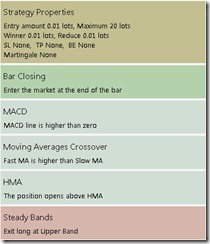
Initially, the criteria used is a combination of the ma5 over ma85 and the 26,15, 1, Macd over the zero line. I do not use the simultaneous cross as those do not always line up and many entries would be missed.

The generator added two items to the mix, the exit is at the upper band of the Steady Bands and additional entry criteria, the Hull Moving average.

DaveM-0019


The Steady Bands period is 48, the margin in points is 884 and the shit is 0. I would not have ever considered those numbers, however, until the strategy proves itself in real trading, I will go along with it.

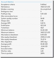
Here are some results.


DaveM-0020


You can see that Win/Loss is 1.00 which is super! System Quality number is very high at 94.49 and Profit Factor is high also.
Quite pleasing results in many areas. This one could be a keeper.
EXCEPT that, there is equity drawdown of 70 percent which is a huge turn off!

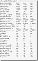
Here are the numbers regarding long and short distribution.


DaveM-0021


From this, you can see that there were only two short entries, both of them losers.

There is not much of a takeaway from this test except that there was a nice appreciation of capital for the period and that the drawdown was excessive making this one not very interesting.

Next will be some work with the faster timeframes and that will be much more rewarding.

Good Trading.!!


Automating The Breakout From The Ichimoku Kinko Hyo Cloud

The breakout from the Ichimoku Kinko Hyo Cloud is quite often a  Range Breakout and represents a good opportunity to see a good profit. The Cloud represents Support and Resistance as well as indicating future momentum, a very versatile tool for a trader.
Today’s application will user the cloud for trade entry as price exits the cloud.


DaveM-0016


You can see on the picture, the price bar originates within the cloud and moves out of it, that is the entry signal we are using for this test.


The Ichimoku Kinko Hyo system is often used on the Japanese currency pairs by the experts, however today’s test will be on the EURUSD pair, daily time frame.

I often trade the EURUSD pair so the choice to use it for this test  is from habit.

Using the FSBPro generator, I set the maximum stop loss at 125 pips which may be conservative for a Daily strategy. Loty size was set at one percent of account balance with the possibility of adding to the position in case of a repeat of the signal.

I did not set a take profit, I let the generator make the selection. I point out that some system developers will set a hard take profit, that is an individual choice.

And the criteria that I did set was the breakout from the Ichimoku cloud.

The data period used is January 3, 2000 to April 18, 2017 with thirty (30) percent OOS (out of sample)
I like to use OOS on all generating applications to hopefully get realistic results although experience has shown that real trading results can often destroy what appears to be a good expert adviser.

Once I started the generator, it seemed to take forever to get any results that looked close to being good…. Actually it took about 12 hours to get to where I thought I might have something to work with.

The end result of the generating was the addition of Fractal for additional entry criteria and addition of the HMA (Hull Moving Average) as an exit.


DaveM-0015


I prefer to use a generated solution most of the time as the generator tests a huge number of alternatives and selects the best In this instance the number of iterations top get to this end result was millions and millions, there is little chance that I could have made this selection, I would have perhaps used a simple moving average as an exit, I probably would have never selected the HMA.

In this case the end result was HMA weighted. period was 64 and the shift was 95, definitely a much different approach than I would have set up.

So, the numbers are not necessarily what I would prefer although the profits are huge. The ending account balance $408,401.68 is a vast increase from the starting balance of $100.00.

While I would love to have every one of my strategies producing such an amount I have some cautions about this expert adviser.


DaveM-0017


As you can see in the picture, a nice daily income result of $67.14, and the next line tells some bad news, there is an instance of 15 consecutive losses. Most traders could not tolerate that many losses and that is one horrible result.

In addition, the System Quality Number at 3.64 is a lot lower than what I would prefer.

The Win/Loss is also poor at 0.42, meaning a lot of the trades had losses, almost half of the entries went the arong way. The worst result that I can see is a horrendous equity drawdown of 80.87%.

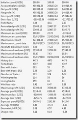
Here is the breakdown between long and short entries.


DaveM-0018


What I wanted to see is the breakdown between long and short, you can see that those are almost equally split, the win/loss is better on the long entries. The profits per trade seem to be better on the long entries.

The average gain in this system is over $5,000.00 which may indiocate a great benefit of trading the cumulative one percent of account balance.

I should point out that the trades on this strategy sometimes last for very long periods and that as time passes and signals are repeated the position is increased and as negative signals are received the entries are closed. That may be a frustration for some traders. I will notpost the trade journal in here as it is very long, (2000) lines.

Conclusion

In summary there are a couple things to take away from this test.
The breakout from the Ichimoku Kinko Hyo cloud will give many trades over a long period and there is some good money to be earned. There are many entries that do not go anywhere and many will show losses.
In future, it may be best to use a take profit and perhaps a trailing stop and perhaps, an additional indicator of some type to improve the win/loss percentage.

There are many possibilities in creating automated strategies, the developer has to test each one. This test was disappointing.

I hope this was of some interest to you, there will be more results to post as days pass.

Good Trading!!


Monday, April 17, 2017

The Simple Scalping System Using ‘Magic Ribbon’

This has to be one of the simplest manual trading systems in existence. The Magic Ribbon system is just about perfect for someone that does not want to have his chart filled with indicators and wants to catch the trend changes.

A very easy setup.
Bollinger Bands 15, 0.05
Bollinger Bands 50, 0.05
Ribbon Indicator
The two sets of Bollinger Bands indicate the trend, the 50 for a longer trend and the 15 for the shorter trend.
The ribbon changes colour as the trend within the shorter trend changes… an easy indicator.

There is an alert built into the ribbon indicator, a trader can have a slew of charts open and be trading all of them.

Time Frames

This system can be used on the faster charts or the longer term charts.

For the trader that has little time to spend observing the market, he/she can use a 240 minute chart or a daily chart, the indicators work perfectly on fast charts or slow charts.

DaveM-0011


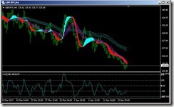
A GBPJPY 240 minute chart. You can see how well the trends and trend changes are illustrated.
Here is a daily chart for GBPJPY.

DaveM-0012


You can see the versatility of the Magic Ribbon system.

I mentioned that there is an alert built into the Ribbon Indicator.
You can see in the picture below that the alert appears as soon as the colour of the Ribbon changes.
Terrific for the trend trader!

DaveM-0013


No trading system is going to be completely perfect. Using this Ribbon will take some practice, a good amount of screen time perfecting entries and exits.

A Stop Loss is a must, and that has to be determined by the individual as entries are practiced.

Personally, I like the idea of a trailing stop for this system, especially if someone is away watching the charts for an extended period.
There are several trailing stop EA’s available, some free and some paid.
Actually, MT4 has a built in trailing stop which is easy to use.

In addition to the indicators described above, I like to have a CCI on each chart to observe the momentum. It is not necessary to have the CCI on the chart, I find that when the CCI gets to the extremes we can expect a reversal in trend, a warning signal.

Below are some examples of the Ribbon on several pairs from today.

DaveM-0004


DaveM-0002 - Copy


DaveM-0002


DaveM-0003 - Copy